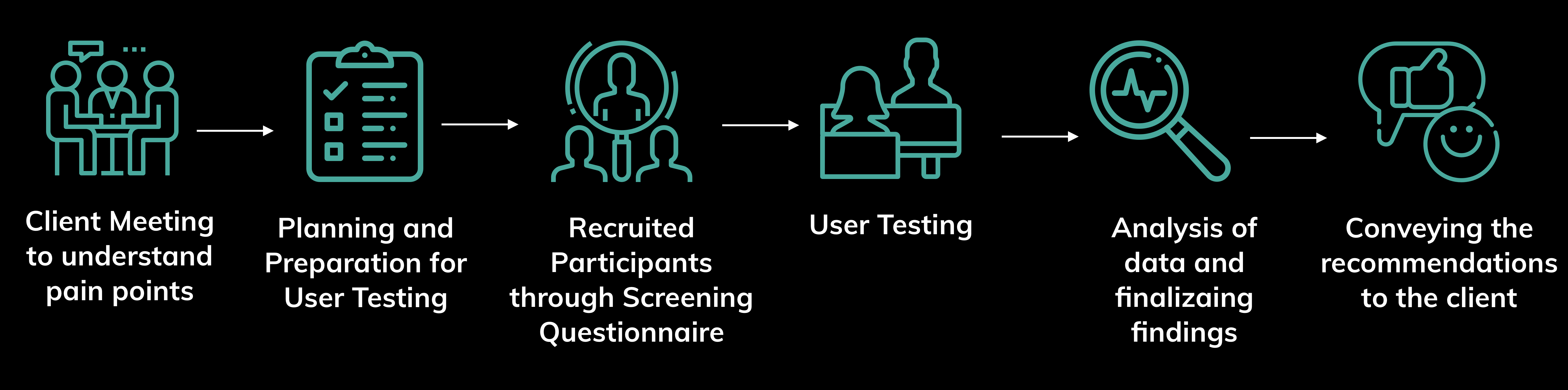
PROCESS OVERVIEW
Process
In order to do the Usability study of the website the following steps were taken:
Usability test of Innocence project's website using User Test Method

How to find potential Usability Problems with the mobile website of Innocence Project?
As a team of four members, we were assigned the task to perform the usability test of the Innocence project wesbite using User Test Method.
In order to do the Usability study of the website the following steps were taken:
The Innocence Project exonerates the potentially wrongly convicted and helps to prove their innocence through bringing forth evidence like DNA testing, etc. They also contribute to reform the criminal justice system to prevent future injustices.
The usability study of Innocence Project was performed using the User Test method.
This is a technique which is performed in a laboratory environment.
The users attempt tasks given by the moderator in a controlled setting.
The test provides both qualitative and quantitative data which can be used
effectively to solve any usability concerns.
I actively participated in the client meeting where the focus on the mobile
site and the engagement of new users were identified through discussion.
The client wanted us to target people from specific demographics.
For this, we decided to prepare a screening questionnaire for the recruitment of
our target users and considered the following factors :
Learning #1 We could reach a wider audience through screening questionnaire which played a vital role in the recruitment process.
Based on the client's requirement participants were asked to perform the below task
I helped to prepare the task and suggested to add task number 3 and 5 above, in order to know what the participants feel when they explore the homepage and to see if the donate process was easy to perform respectively.
Learning #2 The post task questions which were asked after each task helped to assess user’s perceived ease of use with each and also to compare the user’s perception of different tasks.
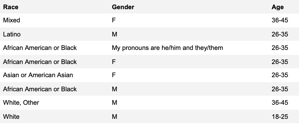
Below is the demographic breakdown of the eight participants who were recruited for the usability test
Learning #3 Pilot test of these tasks was done which helped to rehearse them. This also helped to ensure if the task could be performed smoothly and make improvements wherever necessary.
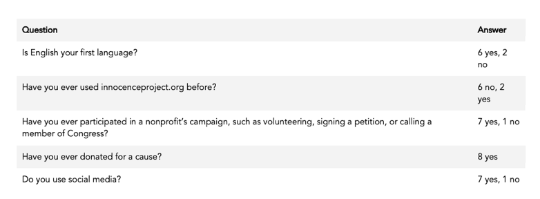
With the motive to gather more information about the users pre-test questions were prepared. Below are the results of the pre-evaluation questions.
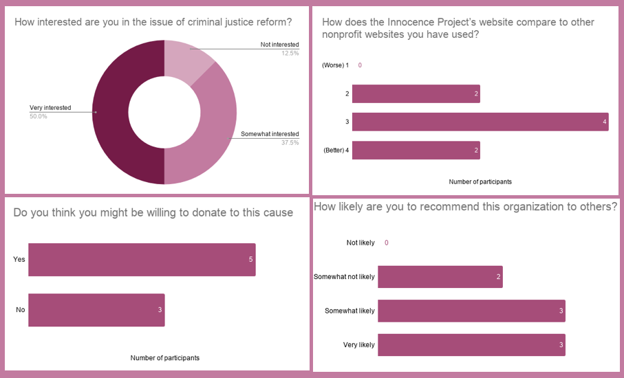
Below are the results of the post-test-evaluation questions.
I helped my team to decide with these questions and suggested to add questions like “Have you donated for a cause” as our client wanted to test the donation option and this question would help us to know if they have used the donate feature in some other website or application.
Learning #4 Pre-test questions were prepared to gather more information about our participants. These questions were decided after brainstorming with the team. Pre-test questions helps to support the user-demographic information.
I conducted the test for two participants and noted down all the main problems which my participants faced during the task. My team members also followed the same approach. After completion of the task by each team member’s participants we discussed all the problems faced by our participants. We noted down problems on post-its with each one consisting of a single problem. This was done for each task. After all the problems were noted down we grouped them and finalized three major problems which needed to be addressed.
Learning #5The affinity map approach helped to address each problem for each task. This was a quick and efficient way to do the analysis as firstly, everyone could address their participants’ problems and secondly, grouping them helped us to know how frequently the same problems were faced.
The response to Innocence Project’s mobile site was positive, with users commenting, after going through all the tasks that the website was “understandable and clear”, “feels easy to use”, and encouraged exploration.
But there were some minor problems which needed to be addressed:
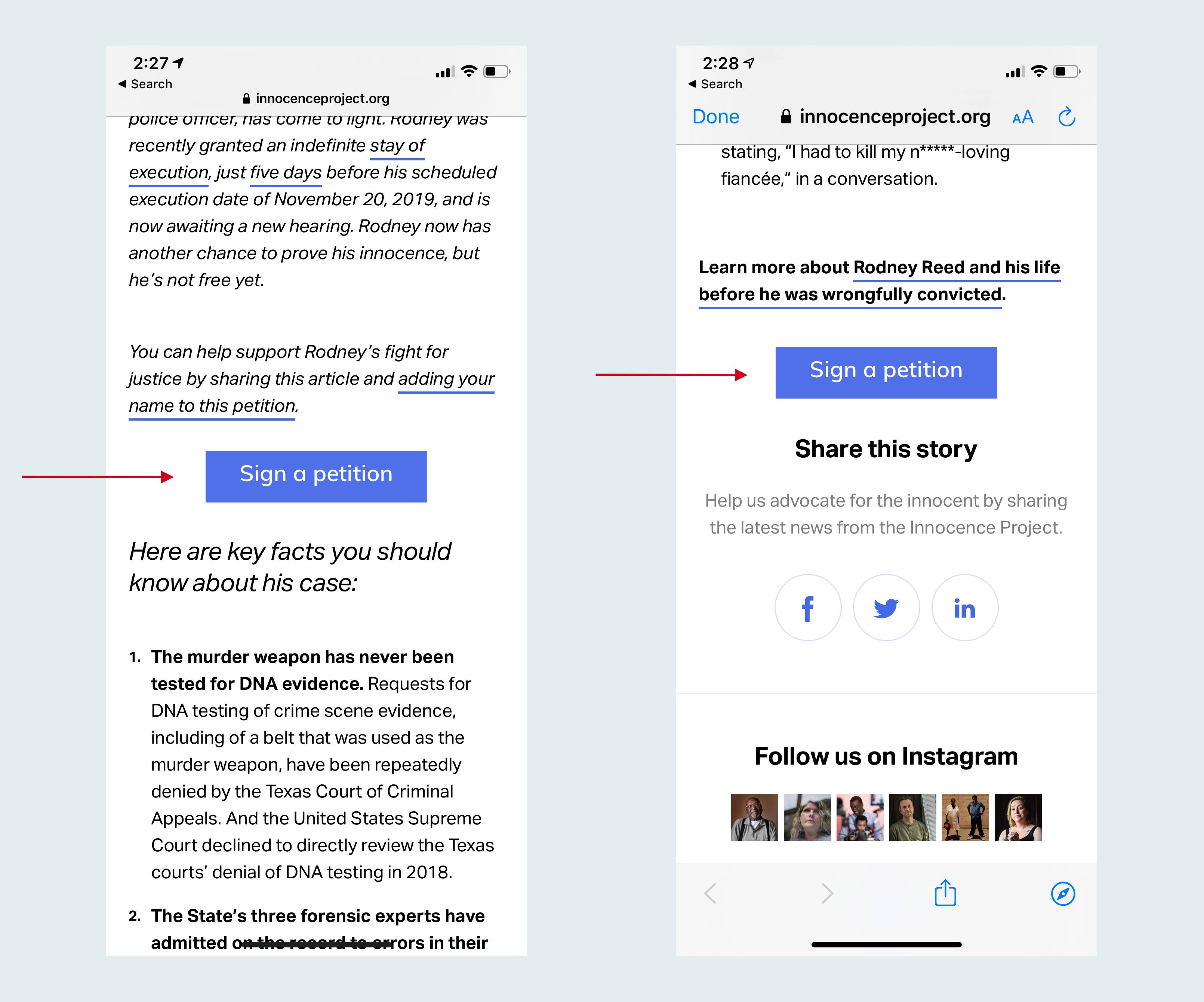
Over half of the participants had difficulty navigating to the Petition page from the “10 Facts About Rodney Reed” page. The problem is three-fold:
A suggestion would be to create a button, in a similar style to the donate button for visual consistency, that drives users to signing the petition. This button should be placed where the current “Join the Fight” link is, and also at the end of the text, before the social buttons. And finally, in order to increase understandability, the language of the button should map directly with the desired action, reading “Sign the Petition” instead of “Join the Fight”
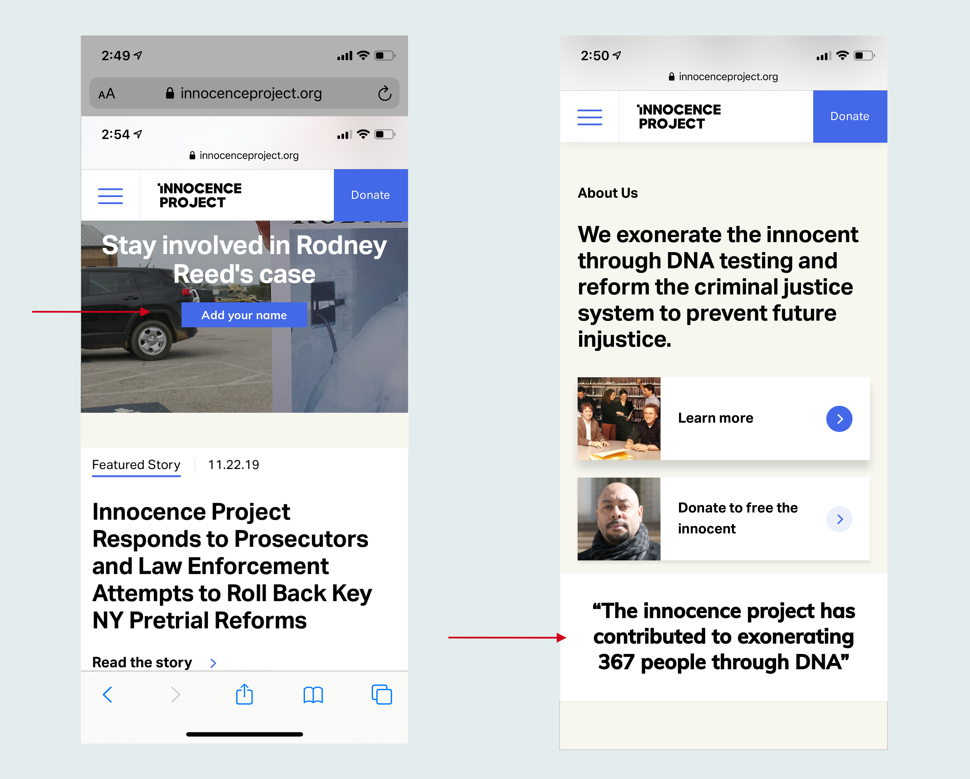
Most of the users like the homepage but some small issues were identified. One of the users said that the "white text is hard to read on a photo background", while some users wanted more big numbers and statistics to showcase success stories and convey the impact of the Innocence Project’s work.

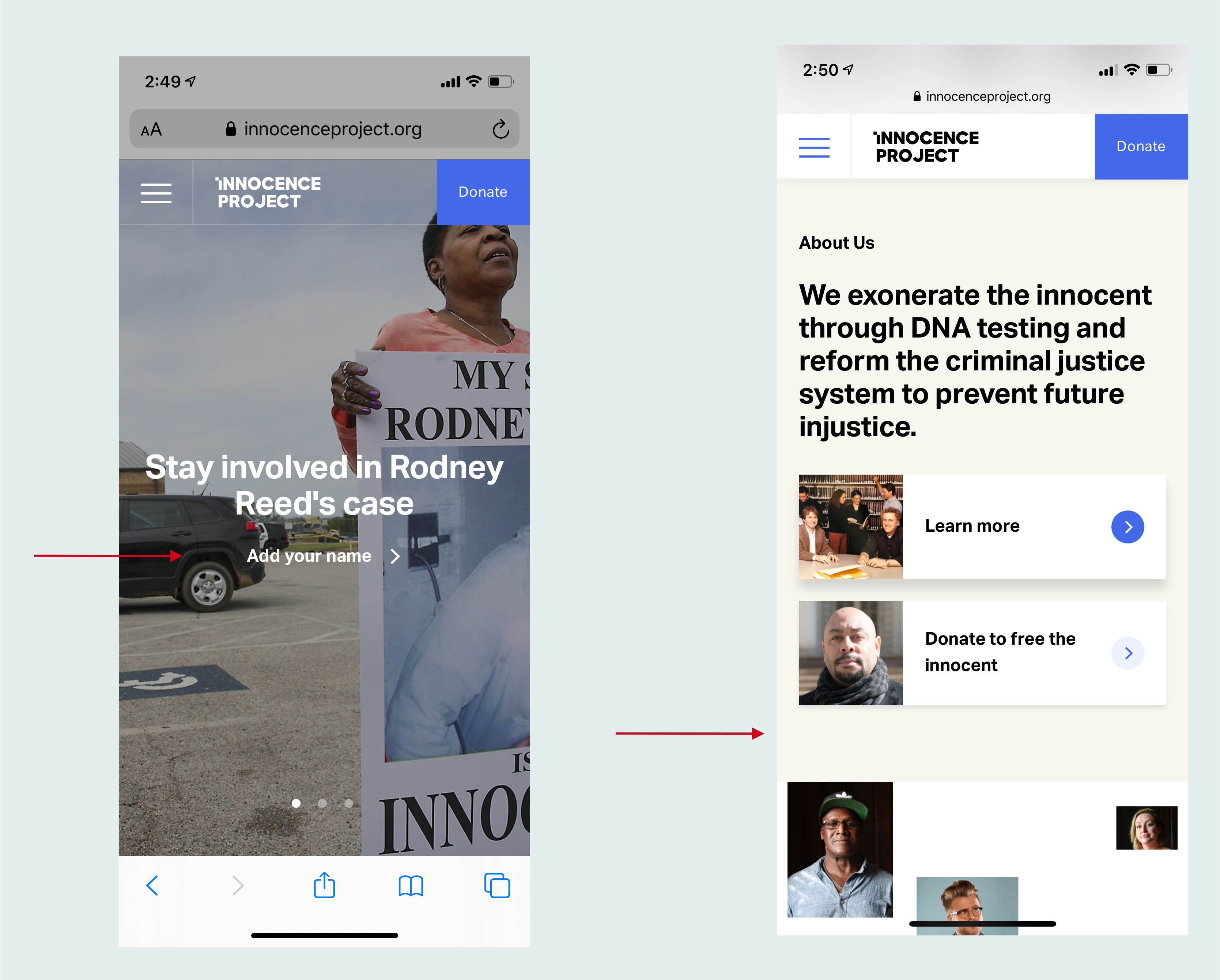
Make buttons look more clickable and add statistics on the homepage. To be more specific, it is better to change the small white text link 'Add your name' to a button that stands out more by adding a blue rectangle under the white text. In addition, participants expressed that statistics about the overall impact of the organization would show the importance of the Innocence Project’s work and compel them more strongly to take action - such as signing a petition.
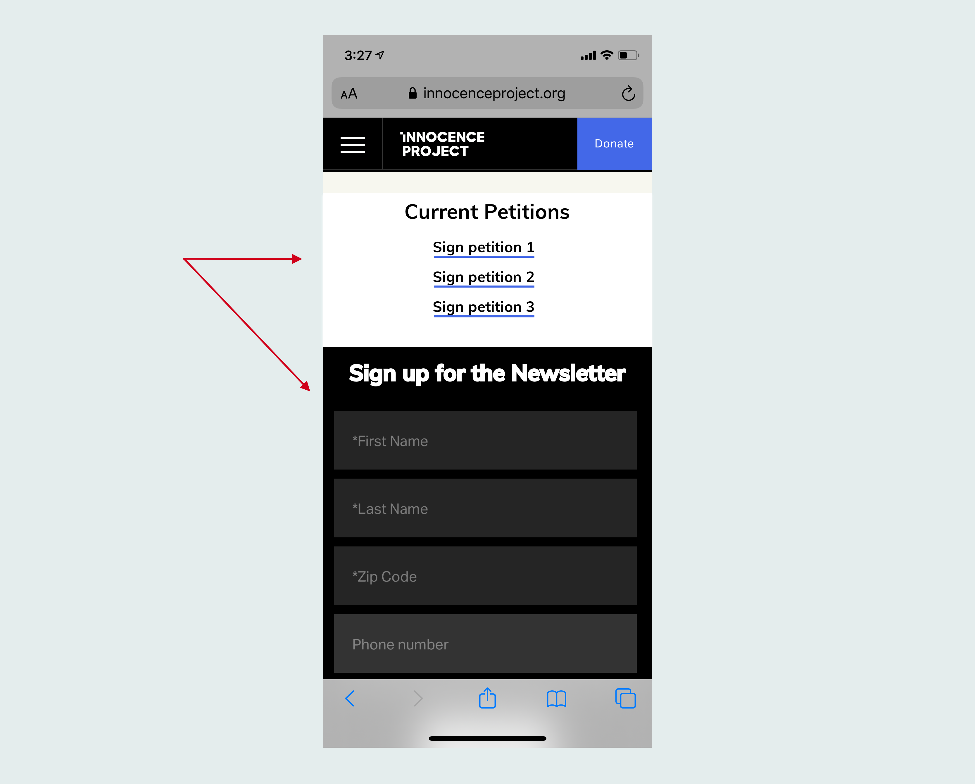
Users appreciated that the Get Involved page consolidated all the ways to support the Innocence Project’s work, but were sometimes confused as to the different options. Users liked that there were many ways to get involved, although sometimes did not understand all of the different opportunities. When asked what they would do if they wanted to sign a petition or call a government official, users were unable to find a place to do so.Another area of possible confusion was the newsletter signup form. It was not immediately clear to all users that the black email form was - while one participant correctly assumed it was a newsletter signup, another wasn’t sure.


If getting users to sign petitions, call government officials, or take other digital advocacy actions is a top priority, these could be featured in a new section titled “Current Petitions” or “Current Campaigns” at the top of the page. This could include links to petitions, or other digital advocacy opportunities To address this, the form could be titled “Sign up for the newsletter” to clarify what the form does.
There were a lot things that I learnt during the process. Summarizing a few of them here: