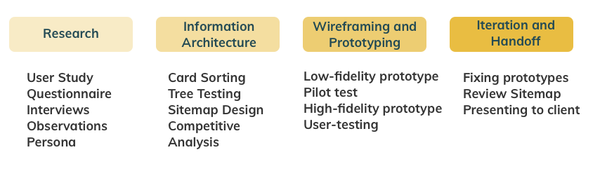
PROCESS OVERVIEW
Process
In order to address the pain points of the website I thought to take the following steps.
Redesigned the Arts For All (AFA) Website
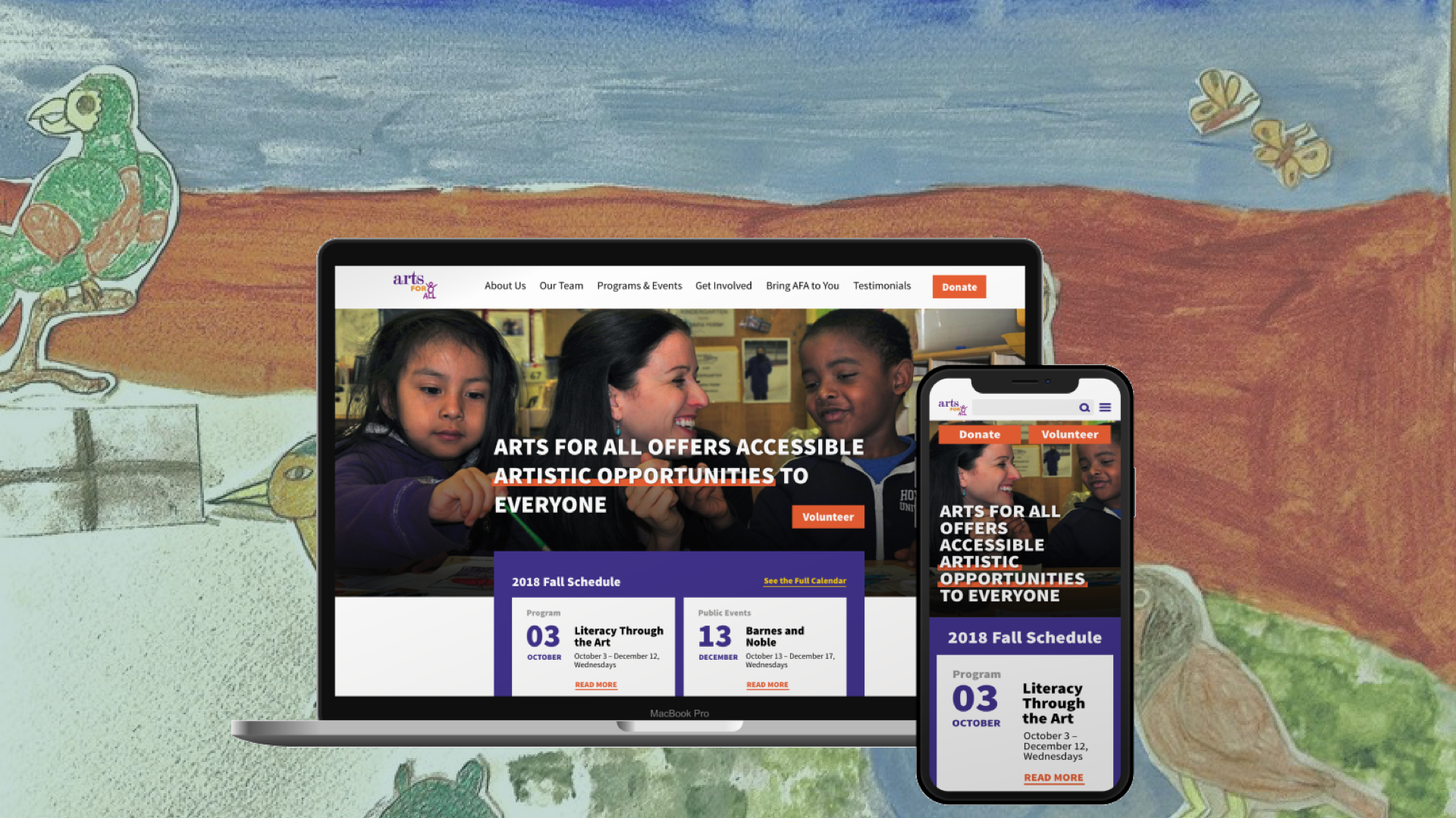
How can we enhance the User Experience of the Website?
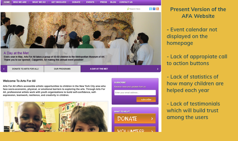
As a team of four members, we were assigned the task to give a modern touch to the website and address the following pain-points:
In order to address the pain points of the website I thought to take the following steps.
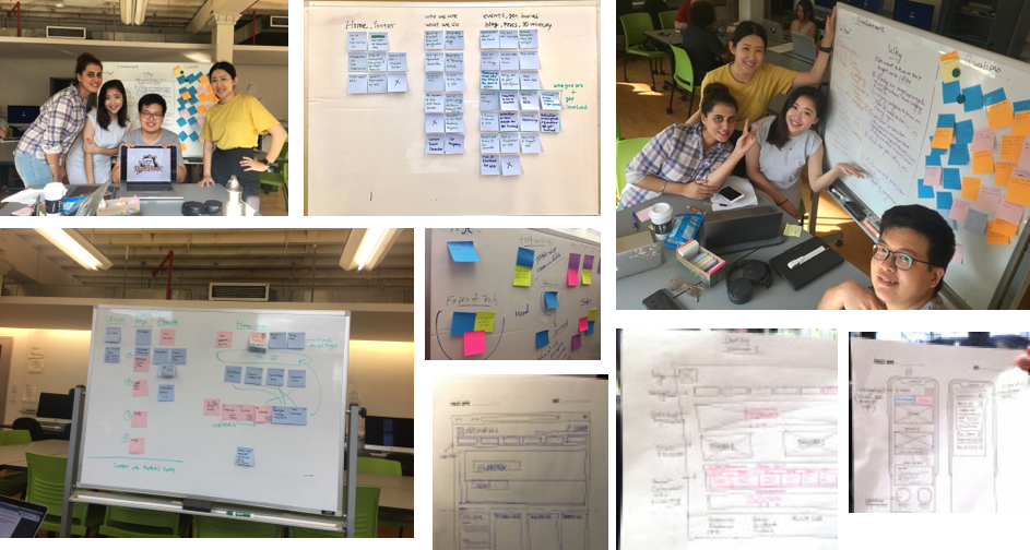
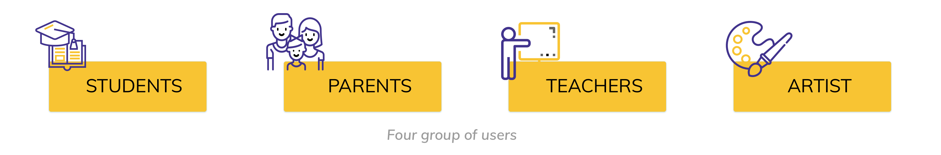
I started with a thorough understanding of the users and divided them in four groups based on their role in connection with the NGO.
I researched on the user group of students while each member of the team worked on a different group. To gain deeper understanding of the pain points of students I explored two approaches:
Designed the face-to-face interview questions in a way so as not to feed potential answer to the users but instead get more insights from them. For example, I posed questions like “When was the last time you made a donation?” or “Can you describe the experience?” instead of asking direct questions with yes or no answers.
Questionnaire were prepared using affinity map -listing the items under “what” for what do we want to know and “why” for the rationale behind it.
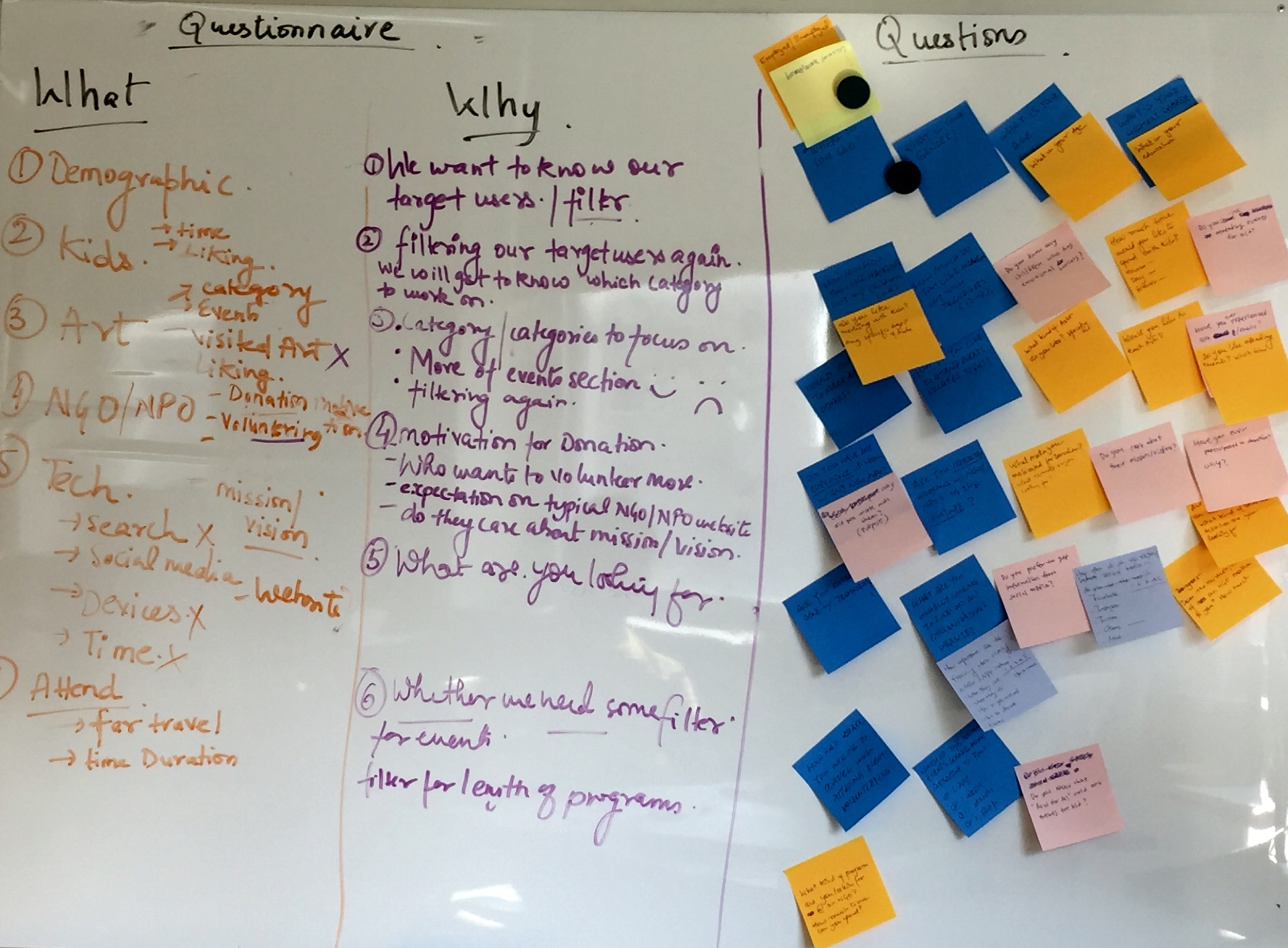
After 2 observation and 10 questionnaire the objective and pain points of student as a user group were jot down in the form of persona in order to get the common pain points of the user.
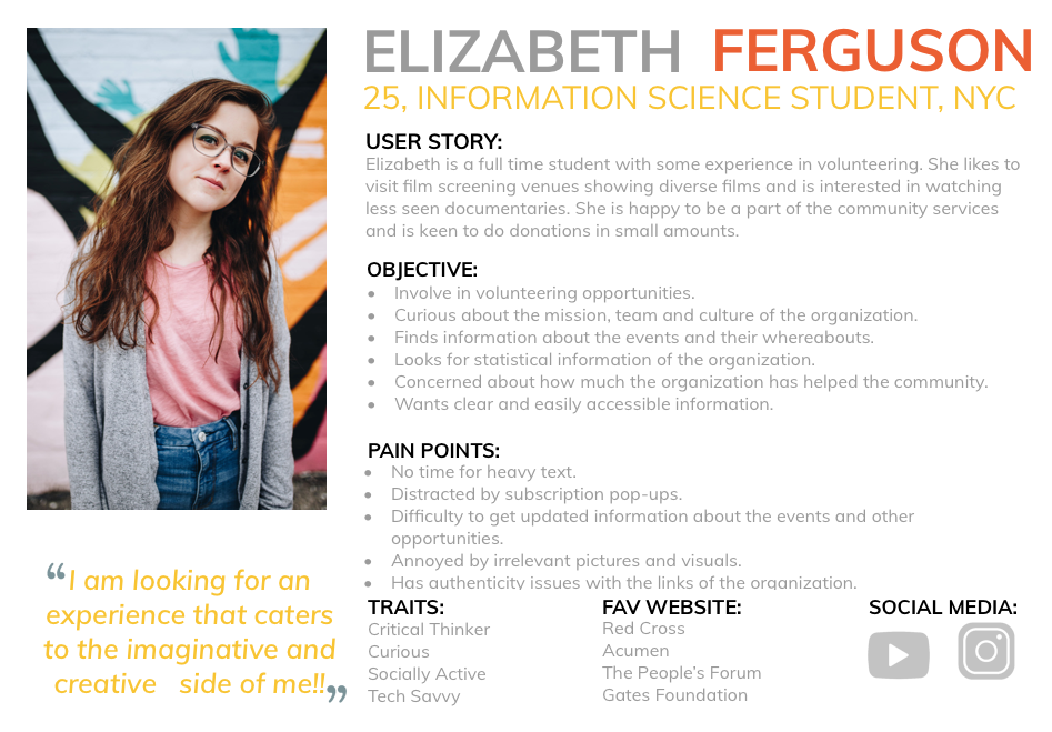
Students are impatient and therefore relevant information should be displayed clearly in short and simple language.
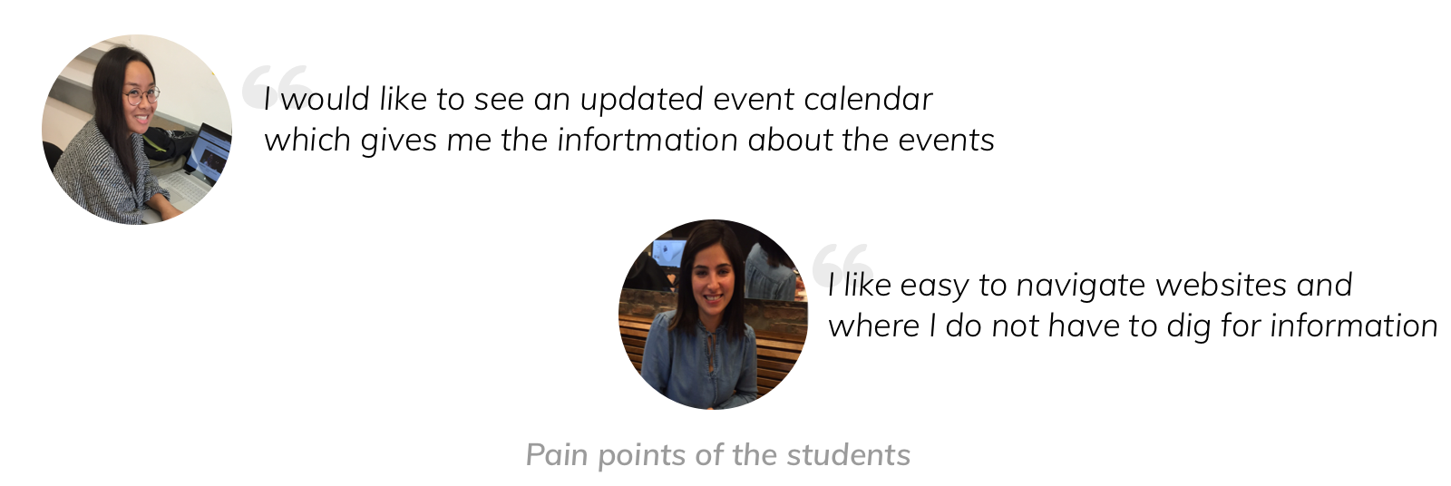
They care about simplicity and do not like cluttered information. They do not want to dig for information and jump between multiple links.
They want easy access to updated information like events and other programs of the organization.
Learning #1 Observation study was found to be more informative with better insights. Initially, I thought of carrying out interview and questionnaire to cover both qualitative and quantitative aspects of understanding the user. After the first interview I decided to try out an observational study and found it to be more informative with deeper insights into the actual journey of the user like user patience with each click, browsing behavior, preference of pictures over text etc. to understand the user behavior than the interview.
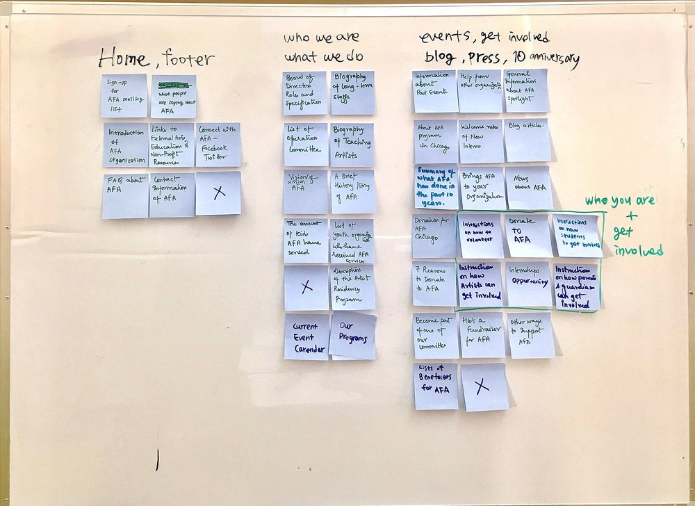
We created upto 40 cards, one for each menu from the current Arts
for All website and used affinity maps to categorize them. Next, we
recruited 8 participants to carry out card-sort test and analyze the
agreement in our categorization.
Card sorting analysis was done through Optimal Workshop’s (OW)
dendrograms by using its best merge method.
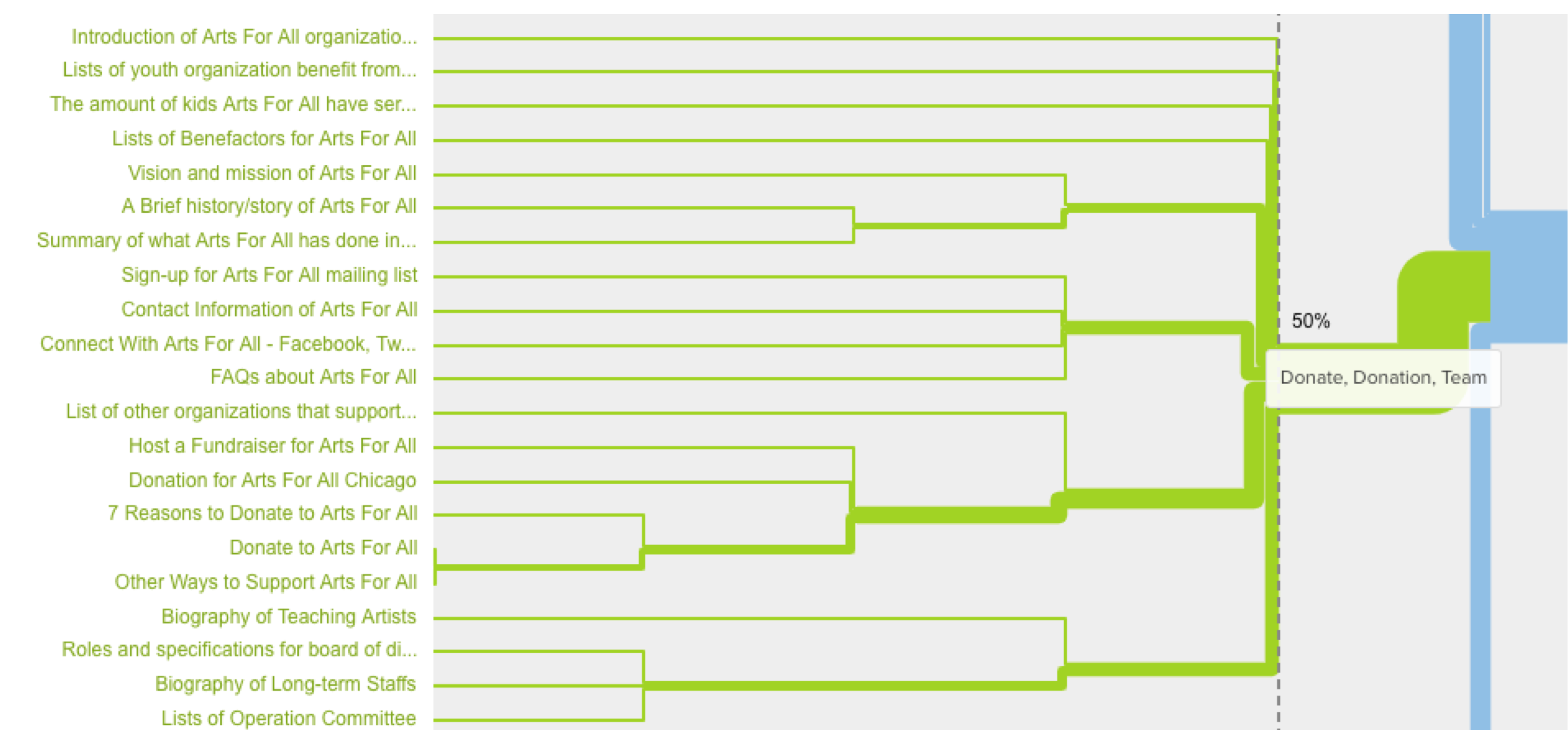
The best merge method often performs better than the actual agreement method when our study has fewer participants. It makes assumptions about larger clusters based on individual pair relationships.
We carried out another study using tree test with different main navigation labels for the same tasks. We recruited 17 participants for the tree test study and carried out a thorough comparison.
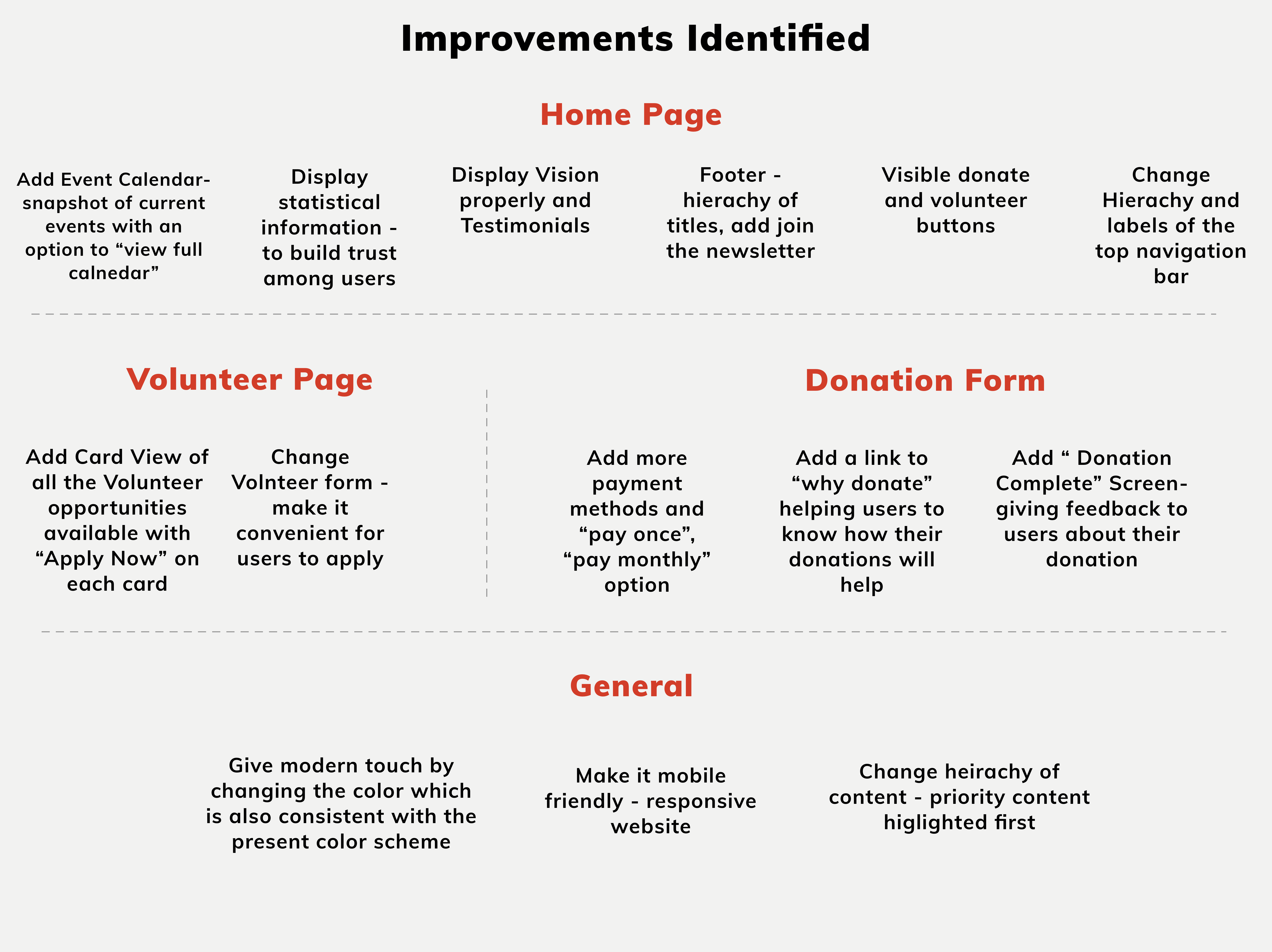
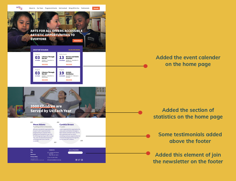
From the study and feedback of users I realized that users prefer clear, simple and short headings. For example, changing "What We Do" to "Programs & Events" and "How To Help" to "Get Involved" showed better results indicating easier navigation. An important task or action should not be on the third level of navigation.
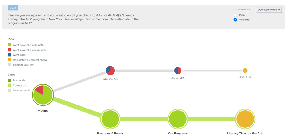
Learning #2 Tree test study was found to be easier than card sorting and the findings from the tree-test showed better results. After card sorting, we made a rough site map and used it for the tree-test study. I found that we got better results from the tree-test like in the above pie tree picture we were able to see clearly where to put the programs in our site-map
I conducted the review of 6 competitors with the goal of identifying priorities for Arts For All web redesign. I used six dimensions - homepage, navigation, donate, statistics, content and mobile-friendliness and rated each on a scale of 1 to 3 for each site, 3 reflecting excellence in a dimension.
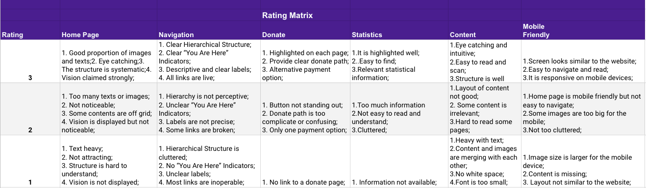
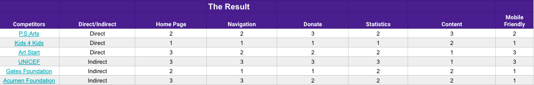
Learning #3 The competitive analysis helped us to generate our own design strategy. I learned that besides a clear hierarchical structure navigation, an eye-catching homepage, and a responsive site for mobile, the content should be legible and intuitive which engages the user. It is also important to show the statistical information which provides the authenticity to the organization’s mission and vision.
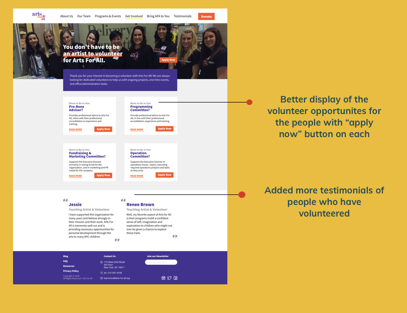
I made the low-fidelity prototypes based on the task flow that were decided as the main task for the users. I made the low fidelity for the volunteer task where the user will find volunteer opportunities on both desktop and mobile.
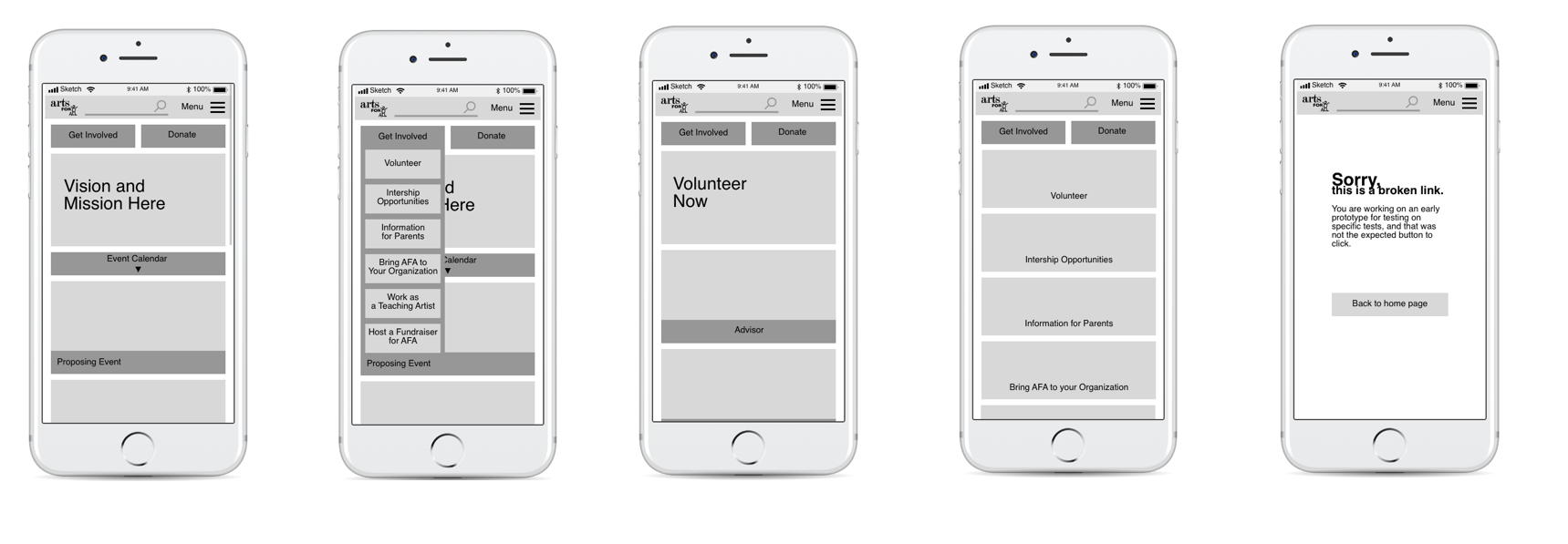
Low fidelity for mobile version of the volunteer task where the user will find the volunteer opportunities from the quick link on the homepage and then go to the next page which will show the various volunteer opportunities
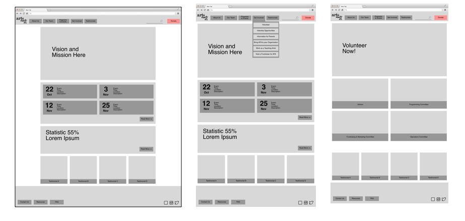
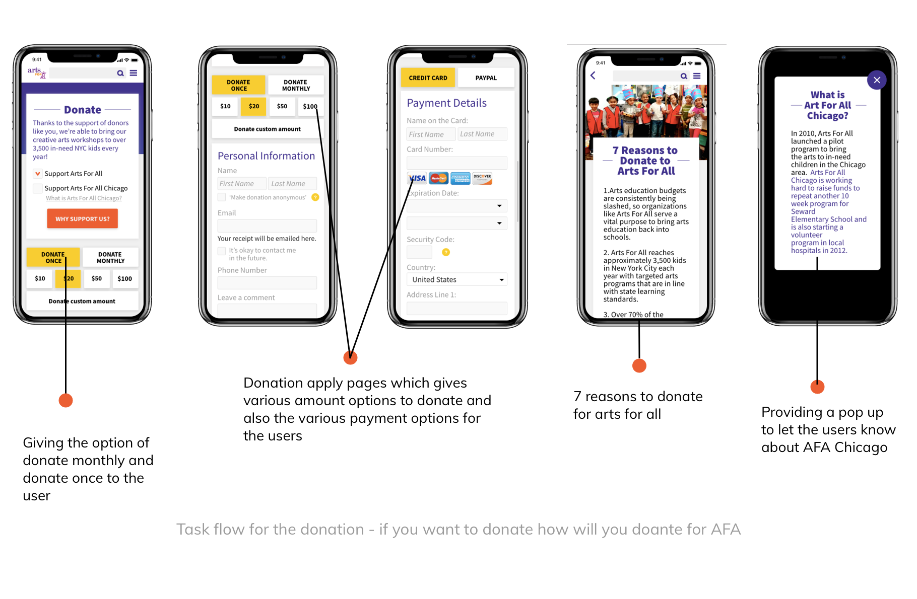
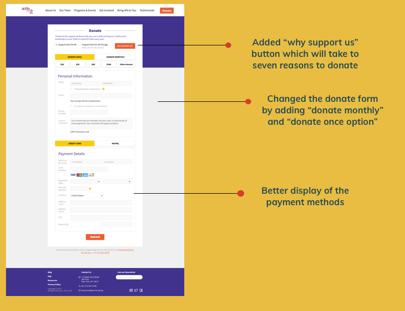
For the hi-fidelity prototypes two task flow were made and taking task flow as the reference the digital prototypes for both the desktop and mobile version were made.
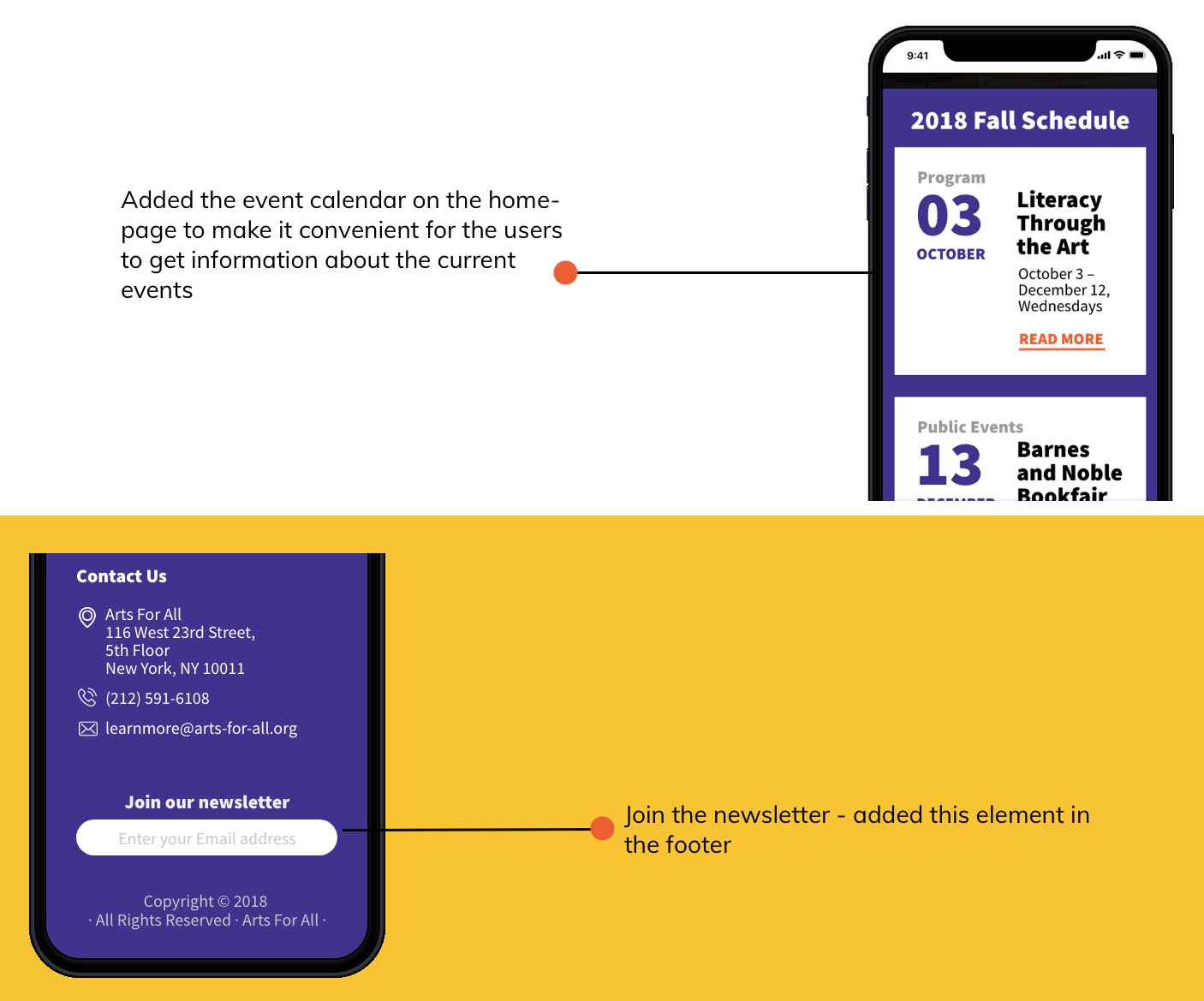
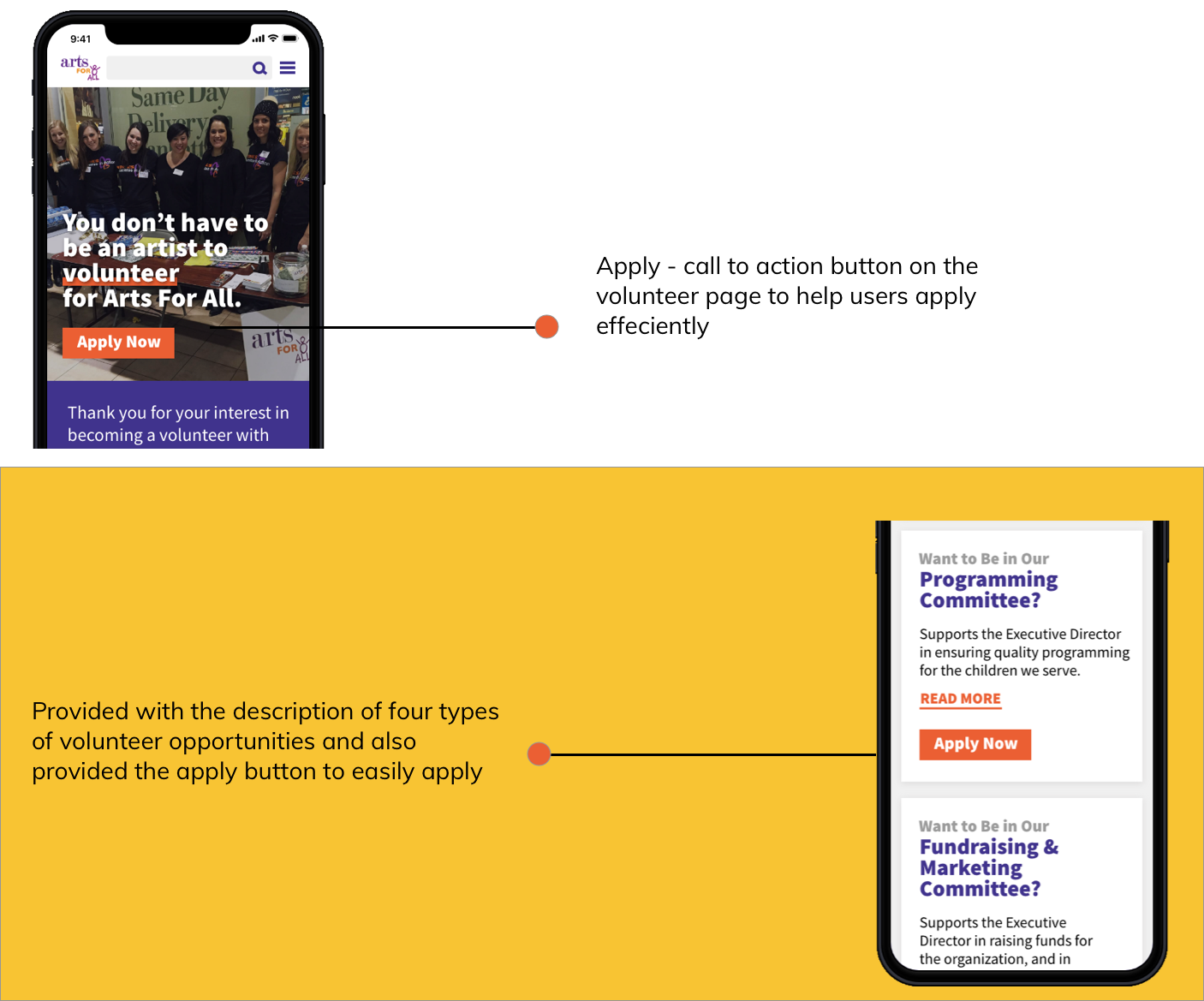
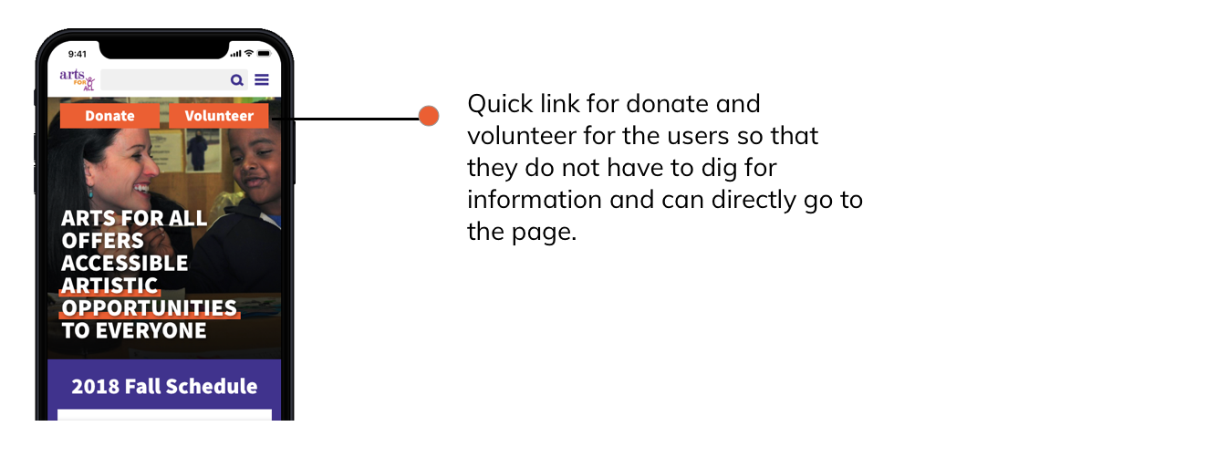
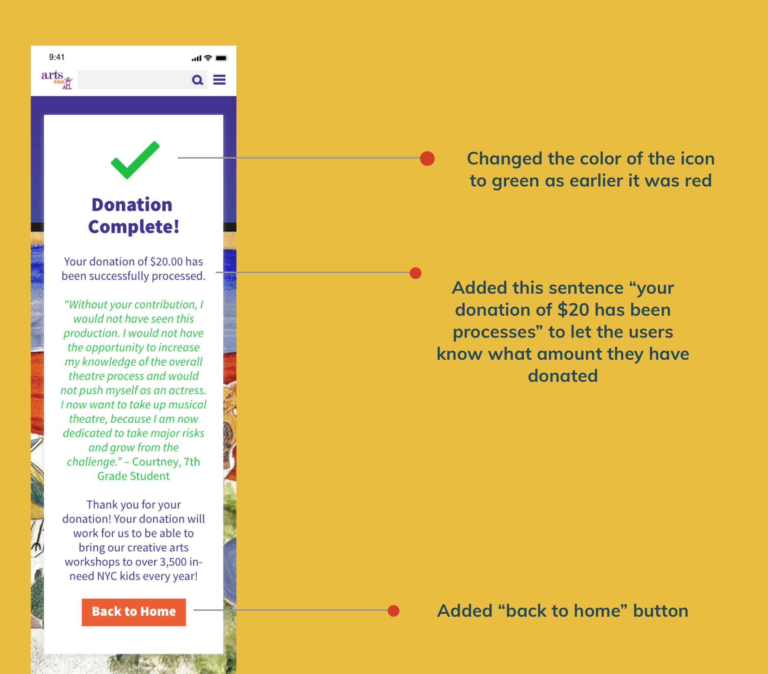
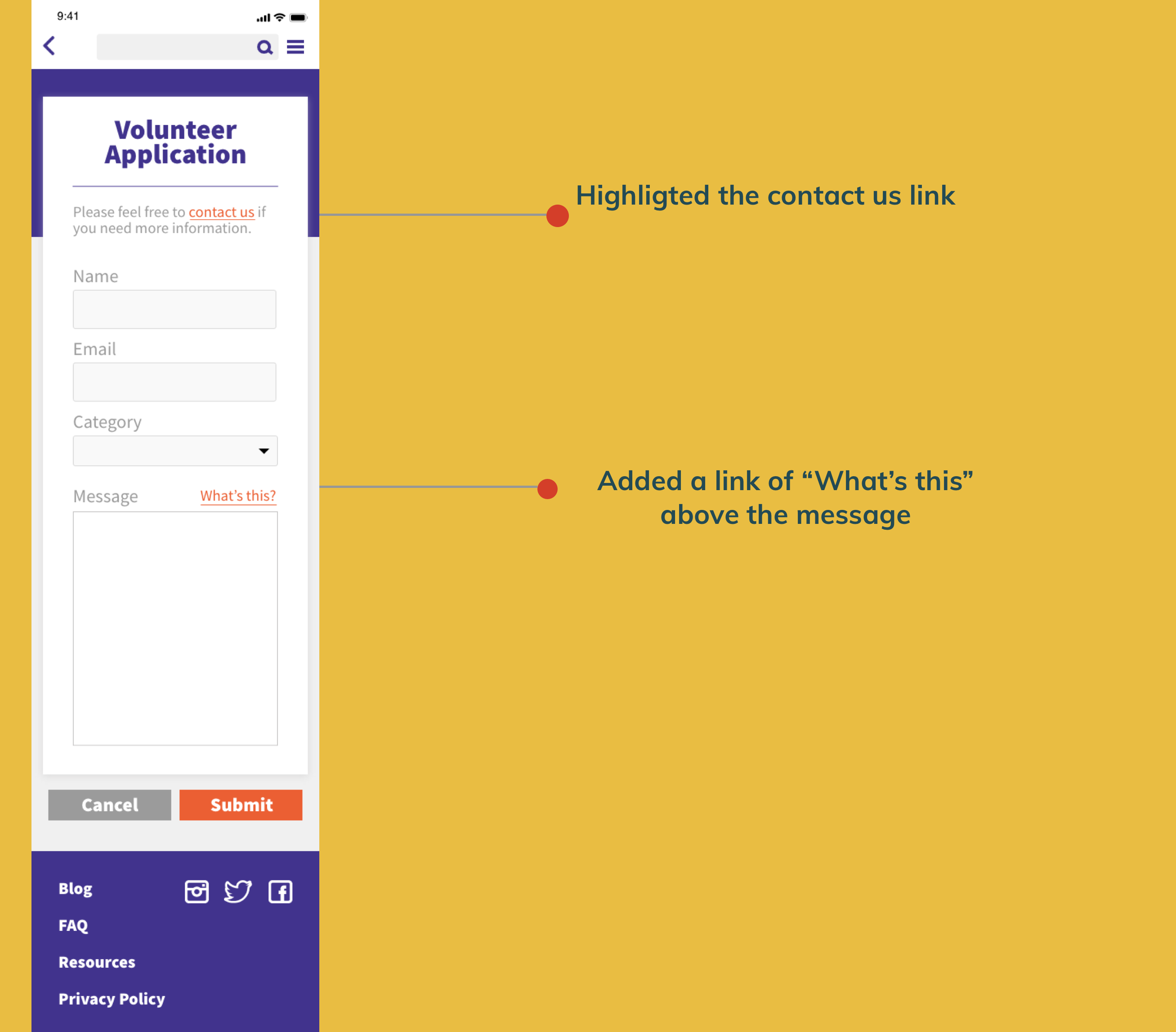
Some iterations were made after user test which were fixed both for the desktop and mobile. Below are some of the iterations that were made in the mobile version which were also made in the desktop version later.
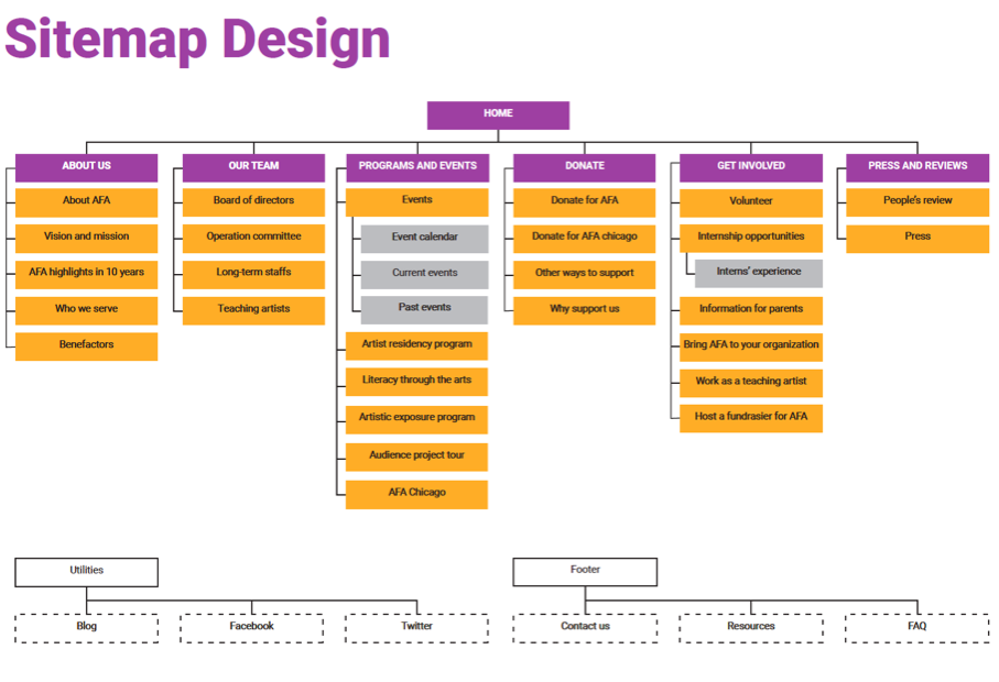
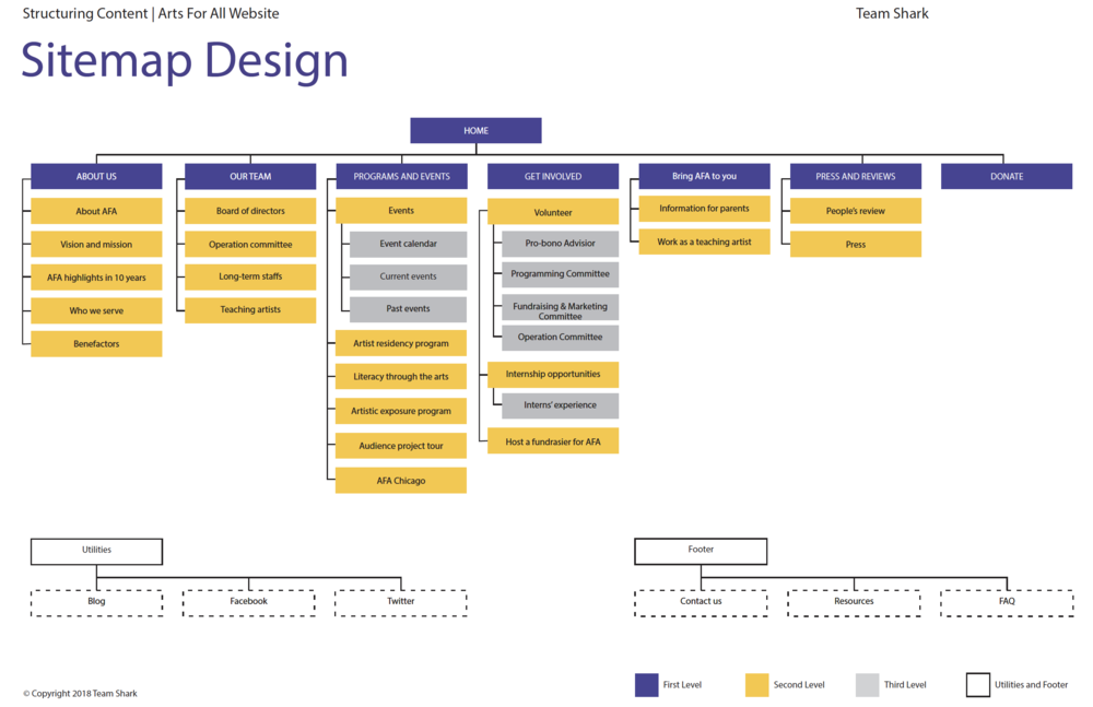
The second version of sitemap was made which was the final version. We added another navigation "Bring AFA to you" as suggested by our client.
Below are the links for the digital prototypes for both mobile and desktop version
There were a lot things that I learnt during the process. Summarizing a few of them here: